High-quality product photos automatically increase the level of your customers’ trust in your Amazon shop!
The alluring aroma of freshly brewed coffee hovers in the coffee shop, quiet and calm music plays in the electronics store, comfortable poufs for buyers are placed in the furniture store – all these are optional attributes, but thanks to them shopping becomes much more pleasant, which increases the likelihood that the visitor will leave with the purchase.
While online everything is much more complicated. You won’t be able to smell or touch the goods here. It only takes eyes to appreciate its attractiveness. That is why it is important for an entrepreneur to do everything to show his potential clients their products from the most favorable angle.
However, buying expensive photographic equipment or shooting in a photo studio is not a cheap pleasure; for novice businessmen, it is usually not affordable. For this reason, let us present several guidelines that can help you take great photos of goods right in your apartment and via your phone.
How to take product photos for online business? Tips
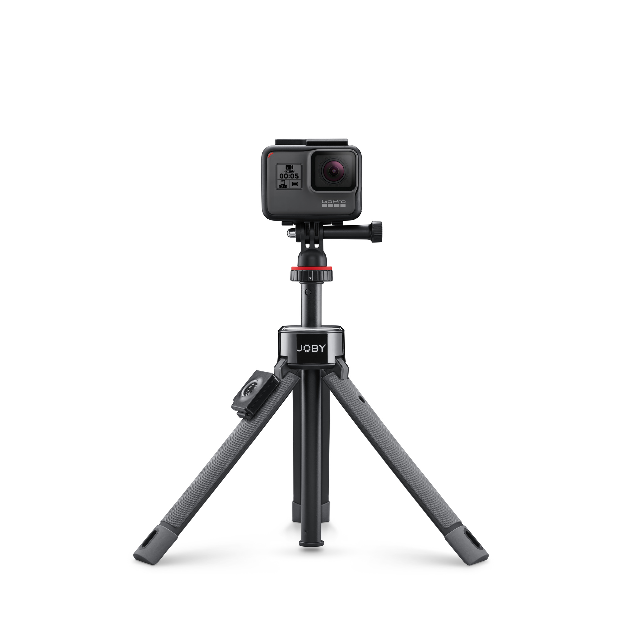
Use a tripod
Whether you take pictures with a camera or a smartphone – it doesn’t matter, the main thing is to use a tripod.
Why? If you are photographing with your phone in your hand or with your phone on something, chances are good that each photograph will be different. For example, there will be a visually different size of the same product, a shifted center of the photo, the edges of the photo zone, and the like.

And while there is nothing wrong with holding the camera when taking just a few product photos. But as your business grows and the number of photos of other products increases, it will become difficult to standardize product presentation across all photos.
A tripod is a guarantee that the camera will cover the same scales, the products will be at the same distance from the lens.
It’s the lightning, not the camera
The main secret of beautiful photography for your Amazon listing is light. Without normal lighting, you won’t get a clear, colorful photo. The lack of light has a bad effect on the photo – the picture is blurry (due to the long exposure, since the camera wants to focus), and “noisy”.
However, we need a photo of the product with clearly visible fragments.
The recommendation is to use daylight. Cloudy weather is the best option. Direct rays of the sun will not work, as they provide too high contrast of bright lighting and enhanced shadows. And do not use a flashlight!
Daylight is also called “soft light” because the sun emits a softer range of light than a lamp shining directly on the product. Look best in daylight:
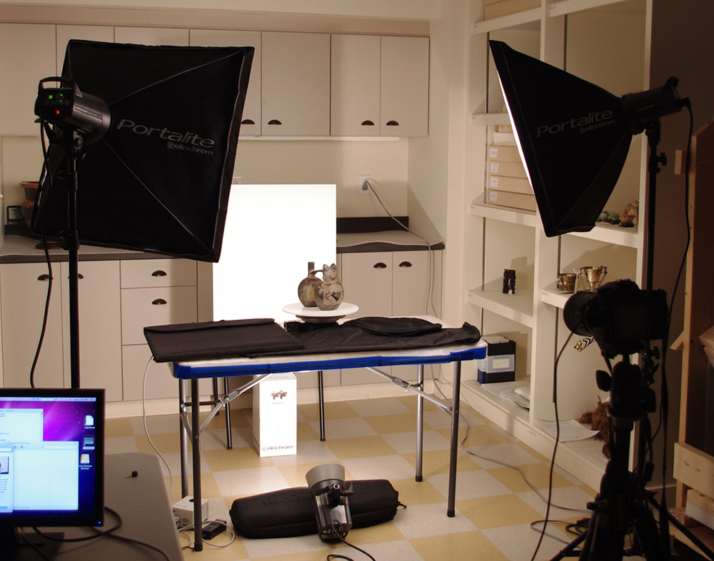
However, sometimes artificial light is indispensable!

The most commonly used are light bulbs. Artificial light is called “hard light” because it creates a smaller but more focused light surface. This type of lighting is for products with details that need to be highlighted in order to impress the online shopper.
Work with only one type of lighting for your photo. After all, adding natural light to artificial light can soften the features of a product that needs to look crisp. And adding artificial light to naturally lit photography can make a product look too harsh.
Fill or bounce highlights to soften shadows
It doesn’t matter if you use soft light or hard light, you need to reduce shadows on the opposite side of the subject from any bright light sources.
There are two ways to do it:
- 1) Switch on a different, less intense light source to complement the main light. This extra light is called fill light and is used as a counterweight to soften the natural shadow that is cast from the light source. Place the fill light in front of the main light so that the product is in between.
- 2) Place a reflector in front of the main source. You can make a reflector with your own hands – fix a white sheet of paper on something, put foam or spend a little time and make a reflector yourself. Buy metallized cardboard and form a stable structure out of it. You can even make 2 pieces to fit reflectors at two corners of the object.
Your goal is to soften the shadow and emphasize the product’s valuable qualities to the user.
Choose the right background
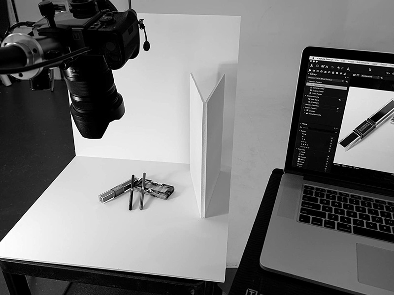
For the background, we recommend using plain textiles, a wooden board or ordinary Whatman paper. Do without plaid blankets, multi-colored sheets and other details that make the image bold and distract attention from the product itself.
White is considered universal for the background. But there are exceptions: sometimes it is better to choose an effective catchy background. For example, if a white background and photographs with it prevail on the pages of your online store. In this case, the photos will lose their boundaries. The products will appear to be laid out across the web page itself. Don’t be afraid to experiment! Place your product on the background (the color scheme will be suggested by the product itself), turn off the flash and take pictures.

The simplest version of the background is a drawing paper or cloth, which was fixed as follows:
Another recommendation: always make sure that the product you are photographing is always in focus. To do this on smartphones, use portrait mode or selective focus.
Stick to a consistent style
All product photos on your website should be similar to each other. That is, they must have the same lighting, be the same size and have the same background. The unity of style makes it possible to achieve the aesthetics of all web pages, as well as to facilitate the choice of goods for visitors.
Take photos from multiple angles
Post at least two images of each product on your site. Before purchasing, everyone wants to know more about him. This means that it is better to add a few more pictures of products in excellent resolution, and if this is not possible (the photo was taken with a phone), then it is necessary to photograph individual elements or bring the product as close as possible.
Macro photography is ideal. The cameras in today’s phones are getting more powerful, and the ease of use of the camera app and the lack of a lot of complicated settings make it much easier to get really great macro shots.
The advantages are obvious – first of all, you can consider the product sold on the site in more detail. In this case, the client’s attention is focused exclusively on him. It is even better if there is an object in the frame that allows you to estimate the scale (for example, a ballpoint pen).
Demonstrate the product in action
Add some pictures of the product being used in practice. For example, if you sell office equipment, you can take a photo of it in the interior.
If you sell clothes, then confidently use your girlfriends as fashion models. So customers will immediately be able to understand the overall dimensions and characteristics, contemplating the product surrounded by everyday objects, and not in a photo studio.
Displaying a product in the environment in which it can be used creates the desired environment and suggests the idea of using that product.
Summary
So, stock up on optimism, perseverance and take stylish photos for your online store, which will further bring you income.
Find the right natural light, use a uniform background, take multiple photos of the same product from different angles and in a variety of environments, get creative! Your task is to sell as many goods as possible. And you need to be able to do this with taste.
Yours, Amaz.Markets
0

